Homebuilding @ BuildLabs
Demystifying a high-tech, off-site custom homebuilding business—starting with its homepage.
Role: Product Designer | Timeline: 20 weeks | Tools: Figma, Basecamp
Background
BuildLabs is a construction technology company specializing in custom and semi-custom off-site home building. BuildLabs is expanding and looking to position itself as a modern, accessible, and reliable builder, but their current homepage is obtuse and difficult to read.
Problems
The current homepage is inaccessible. It starts with a “click to enter” screen, which creates an immediate hurdle for visitors to overcome. Once they make it on the page, they’re confronted with jargon, competing motion animations, and a text layout that challenges our top-to-bottom reading tendencies. The site doesn’t speak to readers—it speaks at them.
Solutions
I redesigned the site so it feels readable, breathable, and clear. I collaborated closely with the copywriter on the design and language of the page, ensuring that we give people enough information to hook them without weighing the page down. We worked with people’s reading habits, not against them.
TL;DR
Don’t have time to read this whole thing? Here are the main takeaways.
-
A major stakeholder concern was around users contacting the company without having a full understanding of it—to them, answering questions on a call while the answers are available online is inefficient. So: how can we design a page that piques engagement, that answers visitors’ questions organically?
-
We increased the readibility of the homepage, both in design and content, and added buttons encouraging users to explore the rest of the site—after all, this is a launching off point for users. Sending someone to the “Our Process” page only guides them along their educational journey. As a result, time spent on the homepage went down while key actions—like button clicks—went up.
-
As Buildlabs continues to scale, this homepage will have to evolve to include new verticals. How can it speak to multiple demographics—builders, architects, new home owners—without being confusing?
Goals
User goals
Understanding what the company does and what makes it different. Answer the question, “Is it right for me?”
Business goals
Generating more quality leads and reducing client confusion around what the company does. Plus: improving SEO ranking.
Empathizing
Currently, most of BuildLabs’ clients are educated, wealthy individuals looking to build a custom or semi-custom home in the Hamptons. Some of these clients need an architect or a contractor (which BuildLabs would serve as); others have their own, and want to collaborate with BuildLabs. The latter might share the company’s website with their architect/contractor, so the site has to pitch to both the layman and the specialist.
Pain points
The current design speaks primarily to the specialist—it’s bogged down by jargon and technical flexing. As a result, it’s not engaging. That’s what the copywriter and I had to tackle: how do we present information in an exciting and engaging way, without—in one stakeholders words—"dummifying to the extent that we lose context.”
How might we design an informative yet lightweight homepage?
Brainstorming
We looked at DTC startups across industries—from dental care to e-commerce—and picked up on a few homepage themes: concise “how it works” sections, minimal information, and clear CTAs early on. Given the stakeholders’ concerns about engaging with clients too early in the discovery process, we held off on bold “schedule a consultation” CTAs, instead prioritizing site exploration. It was a trade-off: the friction for users would force them to explore more of our product, and hopefully result in more quality leads for the stakeholders.
Branding
I adhered to the company’s existing brand guidelines, with a few tweaks. No more hard-to-read gold headers—instead, I honed in on blue and gray to maintain a breathable, techy feel.


Iterating
My initial proposal kept the content the same, but softened the blow. I introduced glassmorphic elements, layering text and image to create a sense of cohesion. I also stacked section titles above paragraphs, instead of to the left, so users’ eyes didn’t have to work so hard.


But once the copywriter got a green light from stakeholders to rework the narrative of the page, all bets were off. As the page’s storytelling was refined, its design evolved. Guiding questions included:
When should “our process” be introduced? A Goldilocks conclusion: not immediately, but not at the end. Give users enough time to start to wonder, “wait, how does this work?”
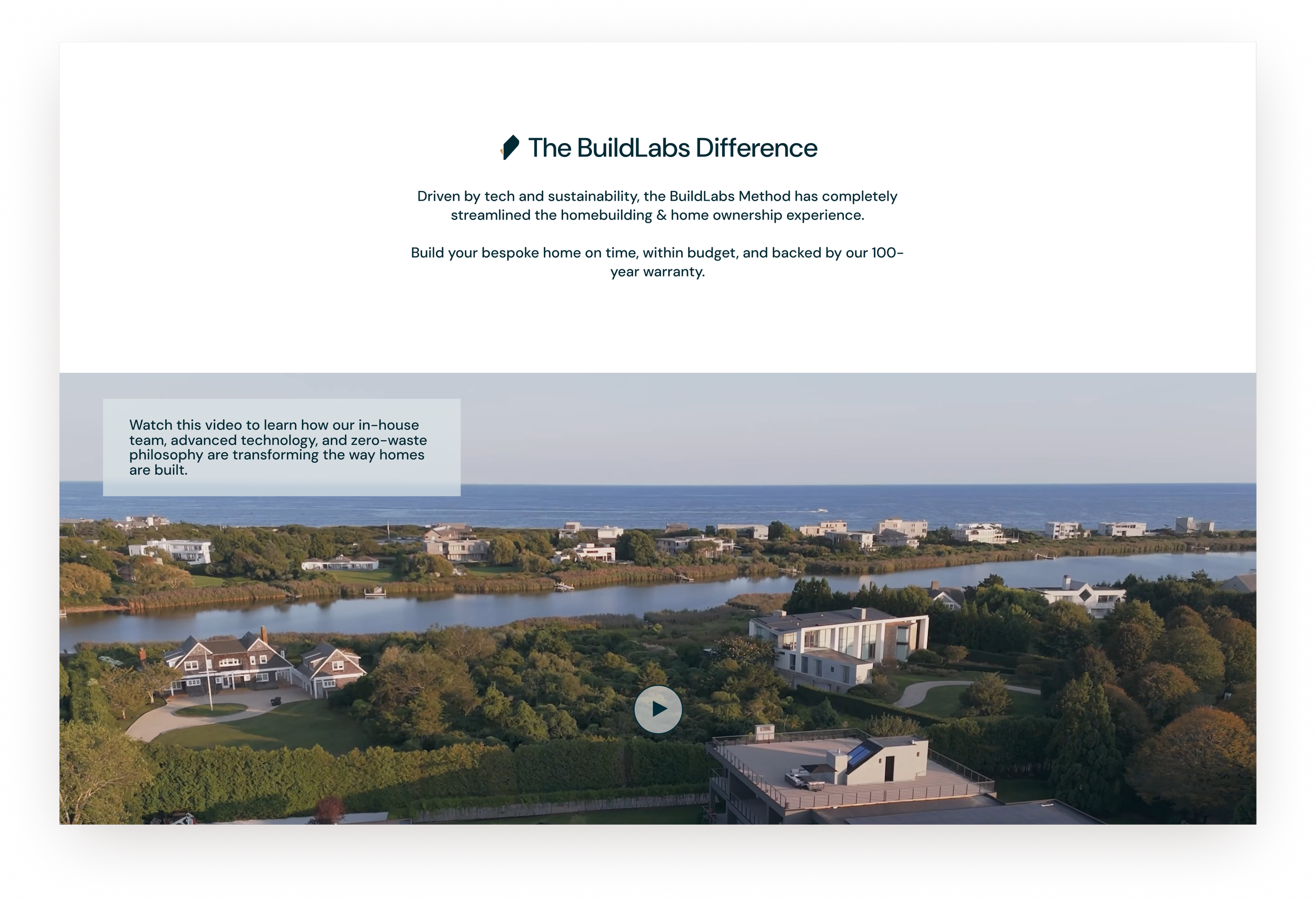
How high up should our value proposition video be? After the hook. Intrigue will be what compels users to click on a video.
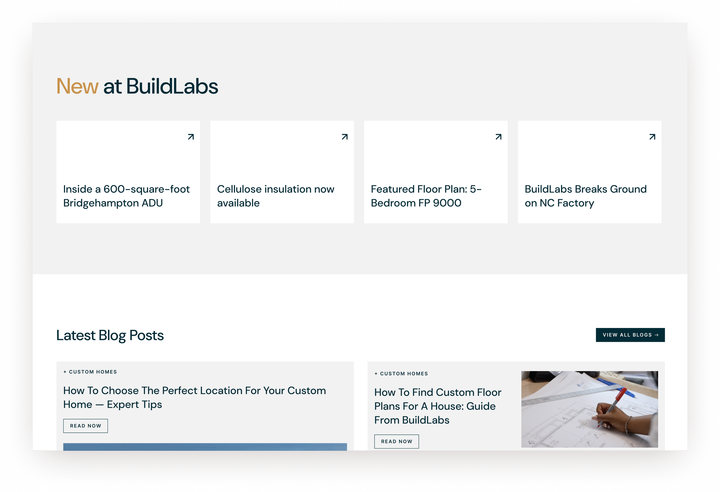
How can we display what’s new at the company? We landed on a straightforward answer. I added a section with cards advertising new floor plans, new materials, new partnerships…I kept it minimal—only four cards, only the headlines—so it feels intentional, not noisy, and I added a hover animation to catch users’ eyes.
How It Works
I spent the most time developing the “how it works” section. It’s a crucial part of the page, the answer to many visitors’ most pressing question. How can it present information without feeling overwhelming? It had to feel easy.
I started with cards that flipped to reveal explanations, but quickly abandoned that idea: engagement shouldn’t be required. Visitors should be able to access and understand this information at a glance. So…cards that scrolled? The solution lay in the copy: once we simplified the language, I could capitalize on a simple, lightweight, step-based design. By emphasizing the number—only four steps!—the design communicates simplicity without having to say much of anything at all.
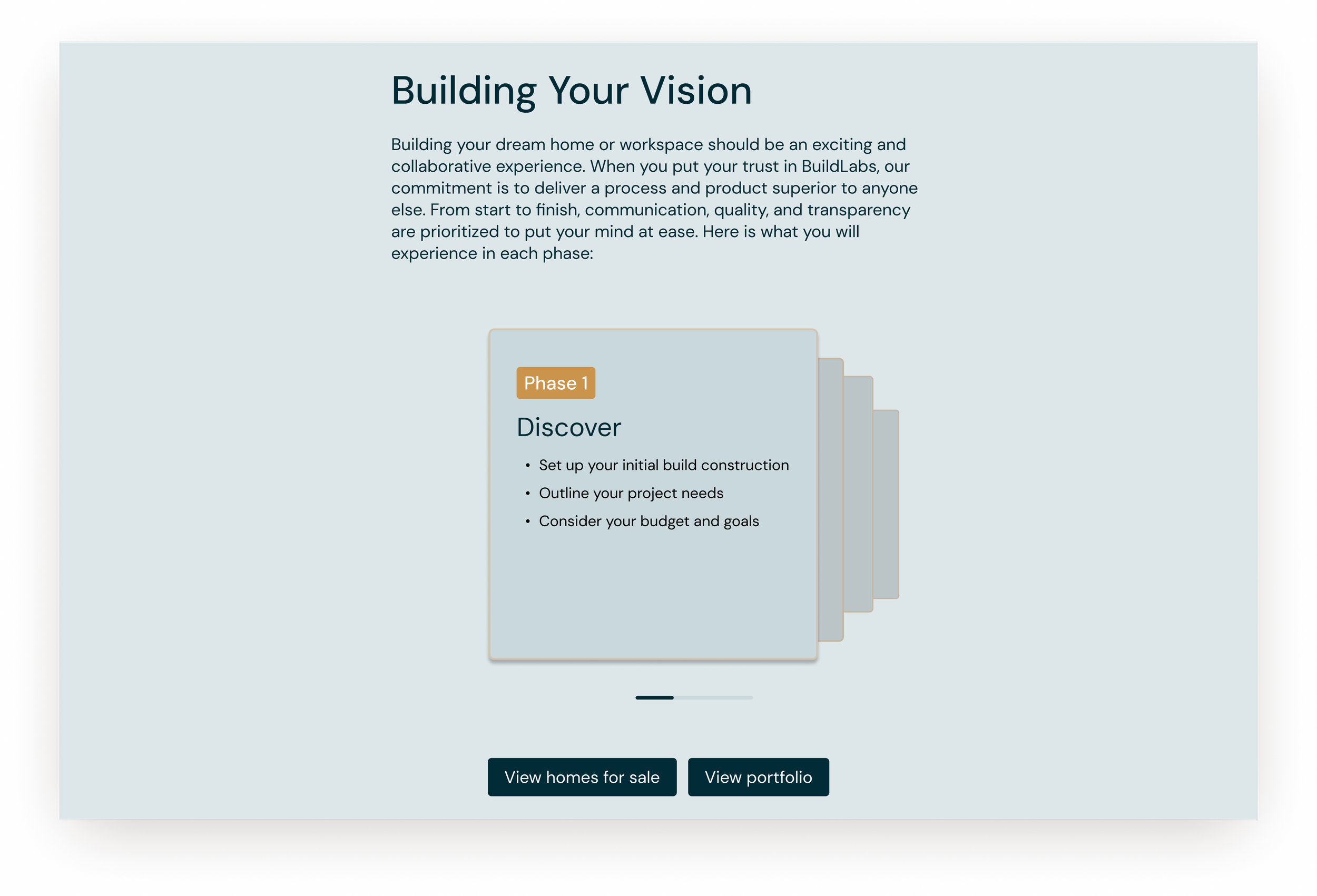
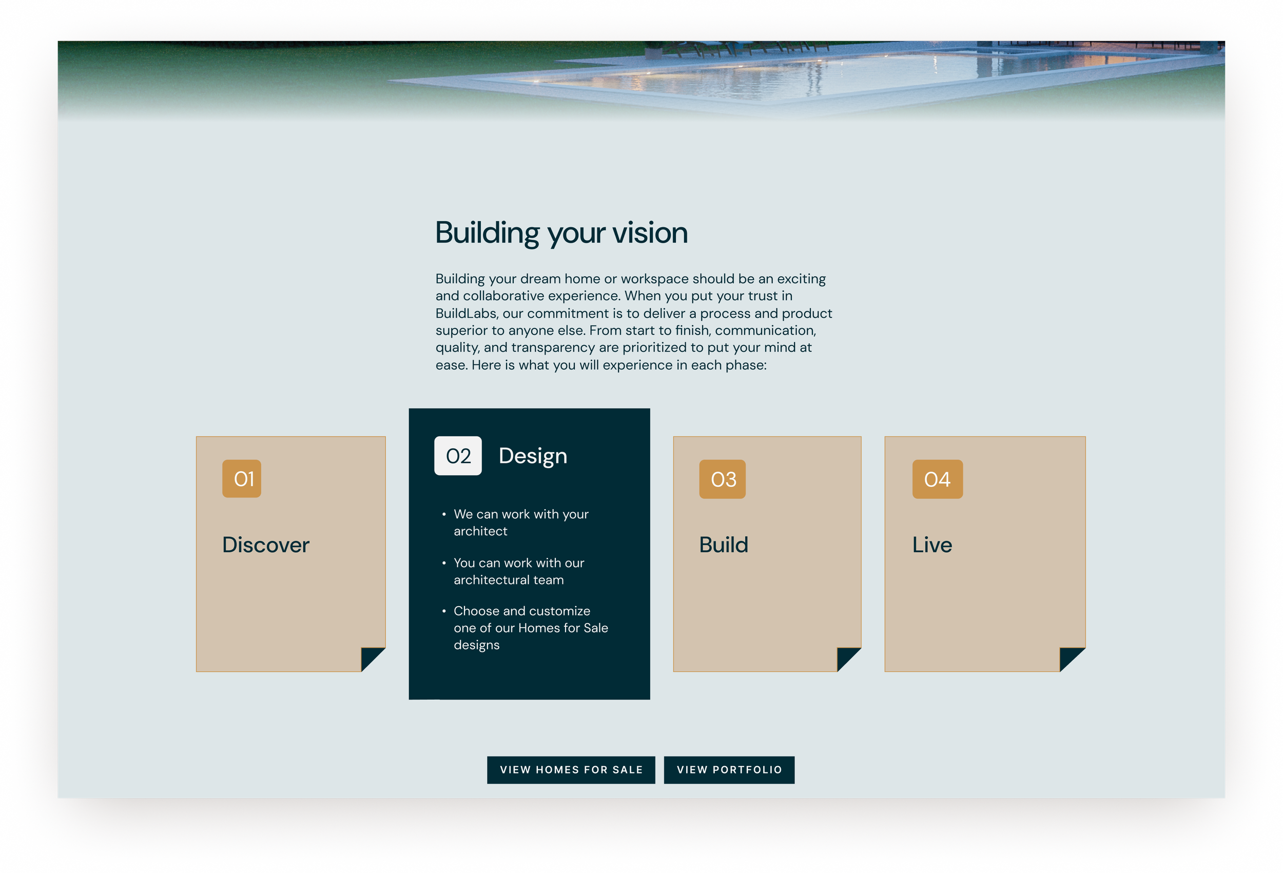
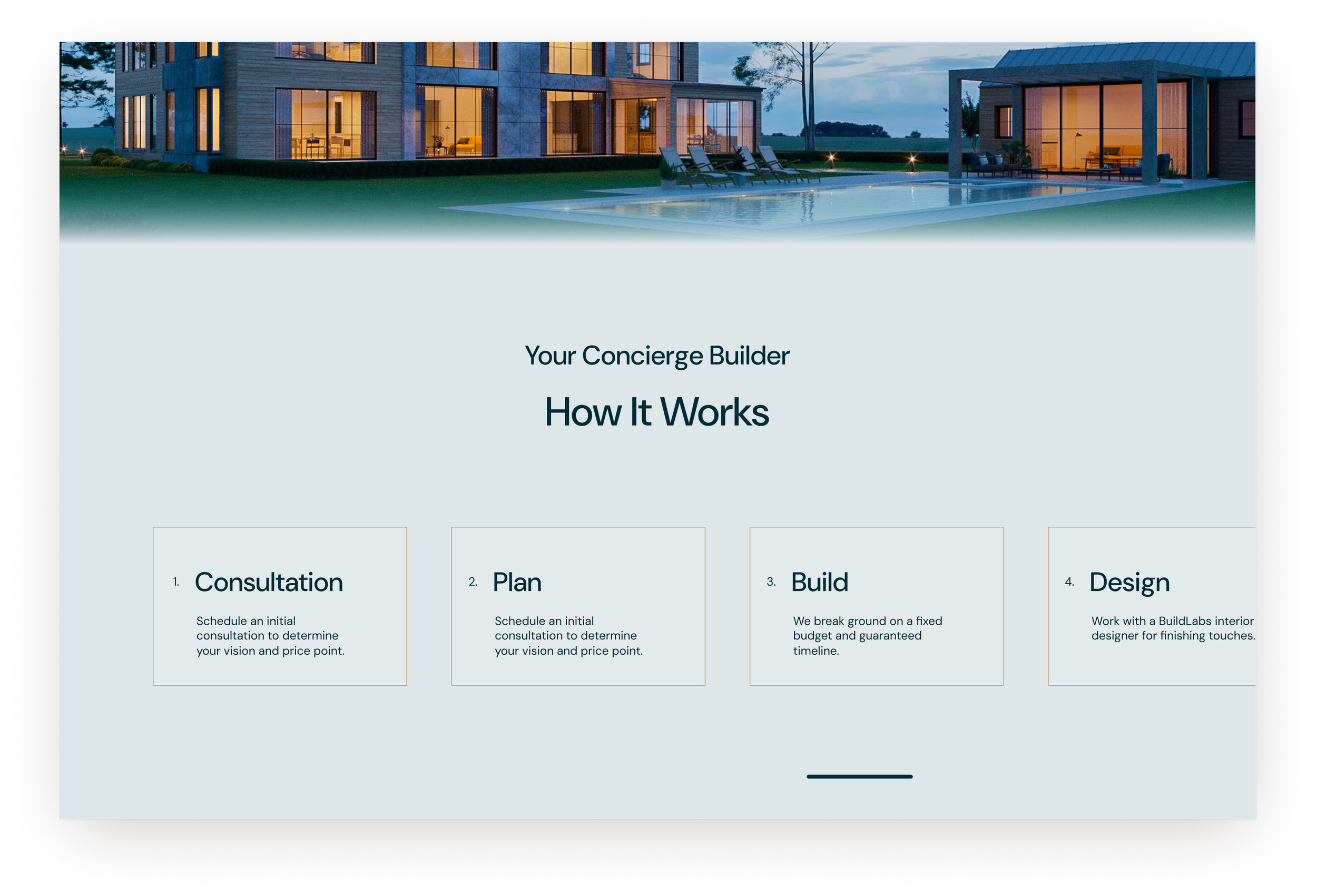
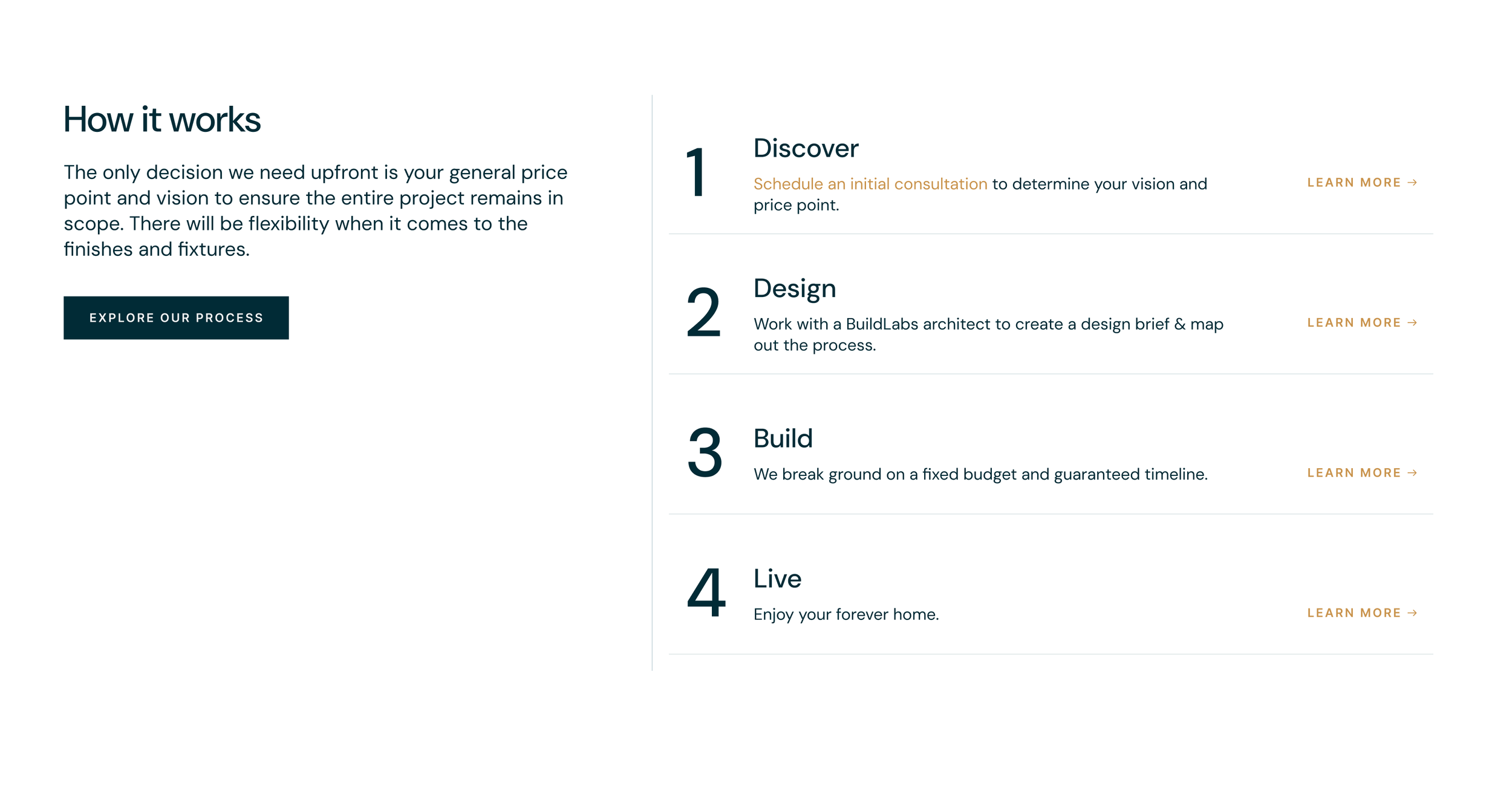
When it came to component design, I explored round edges for their modernity and softness, but ended up sticking with the page’s existing 90-degree angles. Their sharpness preserved the company’s message of precision and complimented the angles of the buildings on the page.
Achieving Goals
Boosting engagement
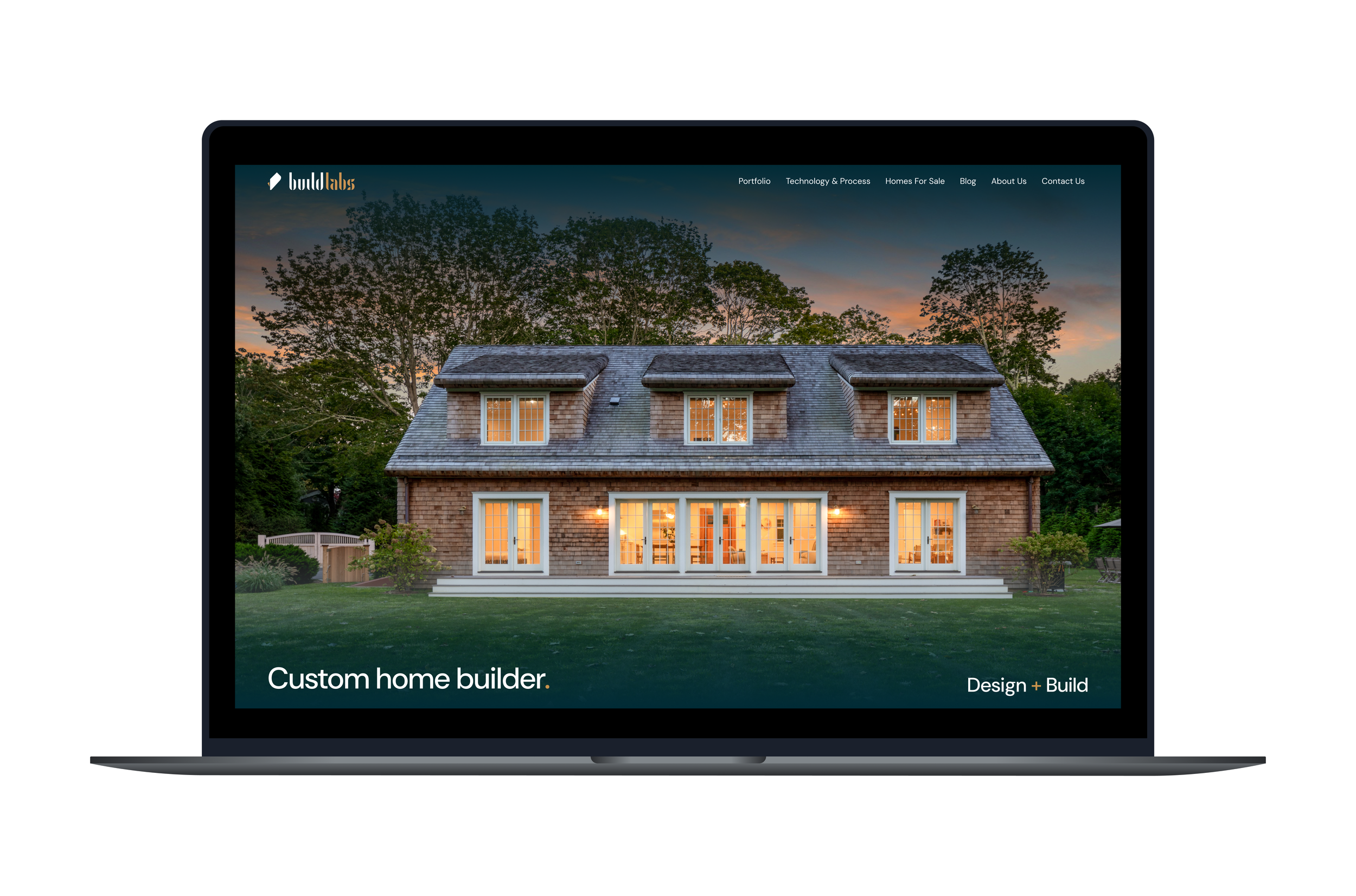
I eagerly ripped off the first band-aid, that darned “click to enter” experience. It was supposed to be awe-inspiring, developed to advertise the company’s work to a briefly captive audience, but the video’s size slowed its loading time and got in its own way. And the aura of exclusivity promoted by the barrier conflicted with the brand’s goals. Not to mention the down arrow: it prompts scrolling, which did nothing. You had to click.

For the rest of the page, the copywriter and I worked together to keep its content engaging. The page starts with a hook, “The BuildLabs Difference,” followed by the value proposition video, which is partnered with a text introduction. By explaining what the video will be about, we boost the odds that someone will click on it—a key pitfall of the videos on the previous version of the homepage. And for those who don’t want to watch the video, its main points are represented throughout the page so they don’t miss anything.
Easy on the eyes
We improved readability not only in language—the copywriter cut the number of words on the homepage by 30% and reduced the average word length by a couple characters—but also in design. I removed the low-contrast gold highlight text and developed a top-down narrative layout. Bold headlines catch skimmers’ eyes, imprinting the company’s core message without forcing people to take the time to read it. Similarly, we abbreviated testimonials and turned them into a slowly scrolling ticker, bringing energy and encouraging discovery without weighing the site down.


The homepage also now honors its role as a launchpad for discovery, with more buttons linking to other parts of the site. I also changed the navigation, moving from the unconventional and missable “four dots” menu into a clear horizontal navigation bar.


Finally, I added sections to highlight what’s “new” at BuildLabs, including one promoting the company’s blog and news stories—not just for an SEO boost but also to help visitors passively learn more about BuildLabs.
Conclusion
I remain a design consultant at BuildLabs, a partnership that’s now lasted over a year, and as the business begins to introduce new verticals, this page will only continue to grow. I hope to experiment with homepage “consultation” CTAs (I believe that face-to-face interaction is key to securing clients early on) and implement more tracking—and that’s just the start.
Compare the two versions of the homepage—and keep up with any changes on the new one—using the buttons below.