Scaling @ KeySurplus
Modernizing the surplus industrial equipment marketplace
Role: Product Designer | Timeline: 50 hours over 10 weeks | Tools: Figma, Notion
Background
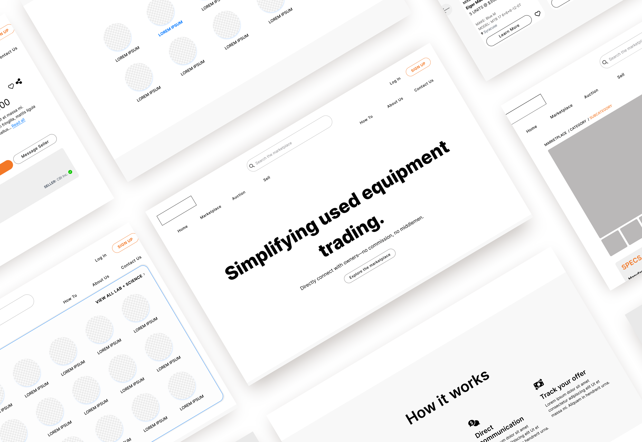
For more than two decades, KeySurplus has provided a platform for manufacturers such as Dupont to sell their surplus industrial equipment—now, it’s looking to modernize by transitioning from SaaS to a full-fledged aggregate marketplace of its own. That includes bringing its Craigslist-ian design into the 21st century, which is where I came in. With KeySurplus in bootstrapping mode, I worked with stakeholders to create the foundation of a scalable design system for their marketplace. By only creating components, I saved them time and money—and refined my own practice of design efficiency.
Problems
KeySurplus’s current website is a web of links, while the online storefronts they’ve designed for some SaaS clients are well-meaning but often confusing, themselves built off of a jumble of OSS components.
Solutions
Audit three manifestations of KeySurplus’s product and create an actionable design strategy that targets low-effort, high-reward improvements. The marketplace currently exists as a cost center rather than a revenue generator, so every decision in the revamp had to be justified and worth the investment.
Build a central design system that improved high-touch, high-value components (such as product cards) and handed it off to stakeholders for them to use while scaling their company.
TL;DR
Don’t have time to read this whole thing? Here are the main takeaways.
-
Reduce, Reuse, Recycle: KeySurplus will maintain private marketplaces for its biggest clients. How can the design feel branded to unique clients, without creating extra or duplicate work on the KeySurplus backend? The key is in creating core components whose tokens can be tweaked to accommodate the clients’ branding.
Popup debate: KeySurplus’s CPO was pushing for a product’s detail page to be a popup window, not a page. I disagreed: not only is it not standard e-commerce behavior, but its navigability and functionality is limited. While I didn’t have access to real clients/users, my outside research informed our final decision: popups were best for displaying minimal information (not a page’s content) and to have it open in a new page would be ideal.
-
KeySurplus is trying to digitize an analogue industry, which presented some fresh challenges. Its main competitors are auctioneers and salespeople used to doing business in person. We considered launching with an auction function, but I realized that timed auctions only be successful with high value website traffic—which would take the site some time to secure. Regardless, I left the stakeholders with designed components for auction product cards.
-
I successfully delivered components for a scalable marketplace design system. I also solved a design problem for one of their biggest clients, whose private marketplace they managed: how to show users that they’re searching within a filtered list.
-
I’d like to restructure the seller experience to make it more intuitive for users (and better for business). Currently, sellers have to deal with a long, archaic form when listing new products, which disincentivizes them from including additional product information—information that would help buyers filter and find their products.
Also: sellers are used to completing transactions offline, which would mean lost fees for KeySurplus. How can we keep the flow on our site? My suggestion: AI-monitored chat that flags contact info exchanges.
Goals
User goals
To easily find the right piece of quality equipment from a trustworthy seller, at a good price.
Business goals
To sell as much equipment as possible, and, as a result, digitize the industry.
Empathizing
“This industry is analog. It can be full of little islands [of in-person sellers]. How do we exist as a nonlocal presence?”
Pain points
KeySurplus has two main user groups: buyers and sellers. Both tend to be pretty old-school in how they work, so, as a new digital player, KeySurplus needed to gain their trust. It also needed to accommodate their quirks: the sellers tended to be pretty resistant to filling out product details when uploading new items to the marketplace, and also couldn’t be depended on for consistent photos, both of which negatively impacts the buyers’ experience.
On a related note: buyers are often looking for very specific qualities in a machine—say, the power requirements of a box furnace—which may not be immediately clear from the product title. How can we help them find what they need, so they don’t have to click into a million different products in searching for the right one?
Lastly, the business is in bootstrapping mode, with three separate website manifestations that need to be merged. One of those is a franchisee-esque marketplace exclusive to one of its main clients, Capovani Brothers, Inc (CBI). KeySurplus needs its design to be flexible enough to cater to the different branded markets, like CBI’s, that it’ll support.
How might we create a recyclable design system that’s easy for the company to scale, and easy for users to navigate?
Brainstorming
I started with an audit of all KeySurplus’s sites, giving its Dev team the feedback they needed to make some “quick wins” on the site’s usability without needing fleshed out designs from me. Since budget was top of mind for the client, this minimized my hours while maximizing their potential growth.
To gain the trust of buyers, I started with studying the site’s visual messaging, its information hierarchy. What’s most important to users?
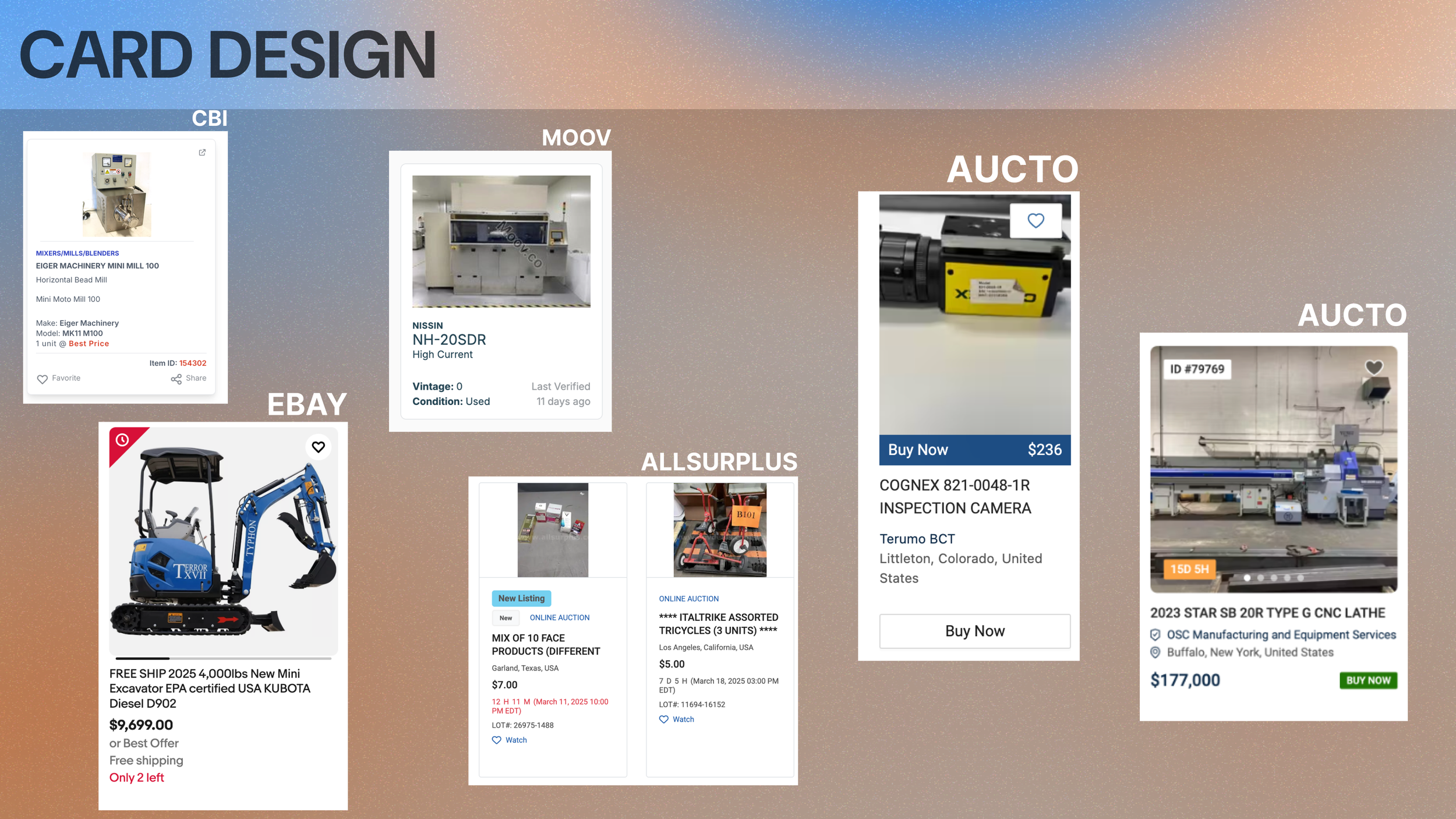
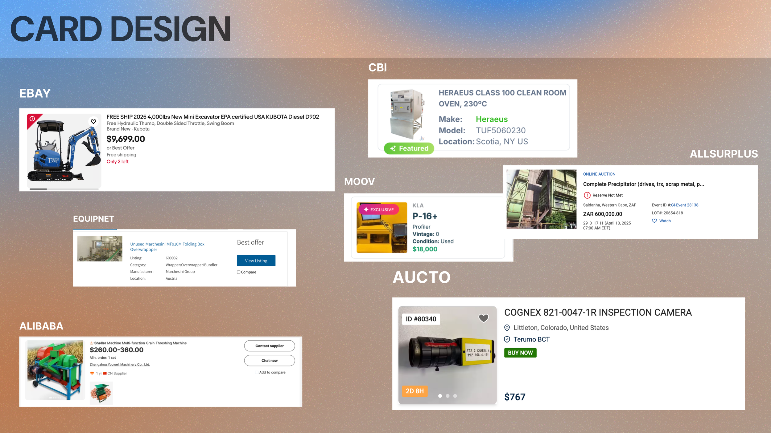
Product cards
The product cards are prime but small real estate, so I had to be intentional with what I put on there. Though I didn’t have access to actual clients, KeySurplus’ CEO told me that photos were crucial. And my research backed that up—mostly. I looked at 5 competitor sites and stacked card designs consistently gave the most space to images, though some sites maintained side-by-side cards, which slotted more space for their lengthy product names.
Product detail page
How do KeySurplus’ users shop? Do they want to quickly scan for the information they need, or would they rather be slow and comparative with it? These were the questions driving my discussion with the CEO and CTO around the value of pop-up “detail pages” versus full-window pages.
Pop-up Detail page
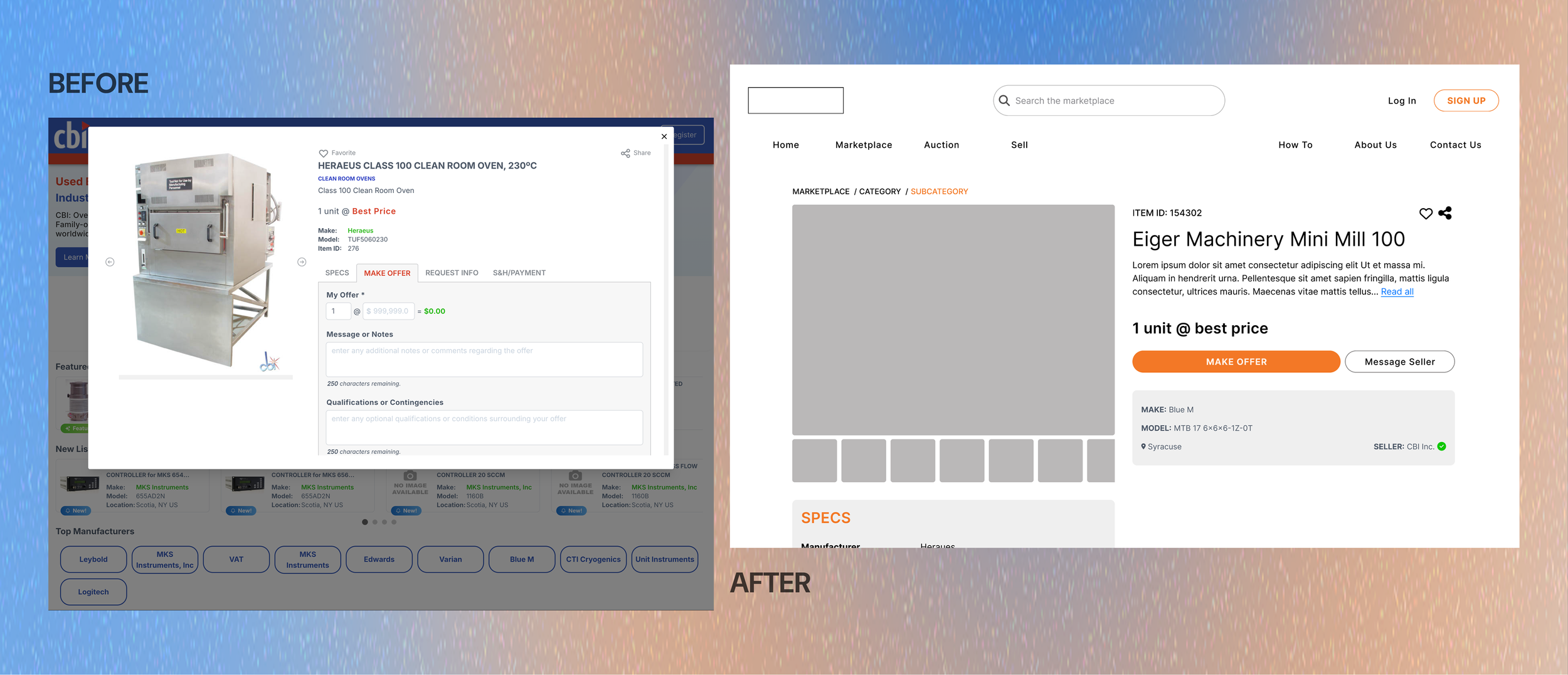
While the CTO favored pop-ups for their immediate gratification, I cautioned against them: these lacked unique URLs to share and made it harder for users to compare products, which they were likely to do. (The current card design only allowed users to open a full page by clicking on the item ID.)
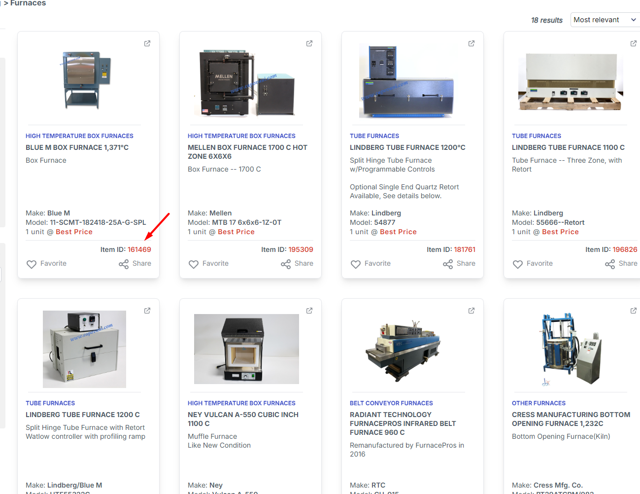
Shoppers have to click on the item ID to open a product’s full detail page.
Product Discovery
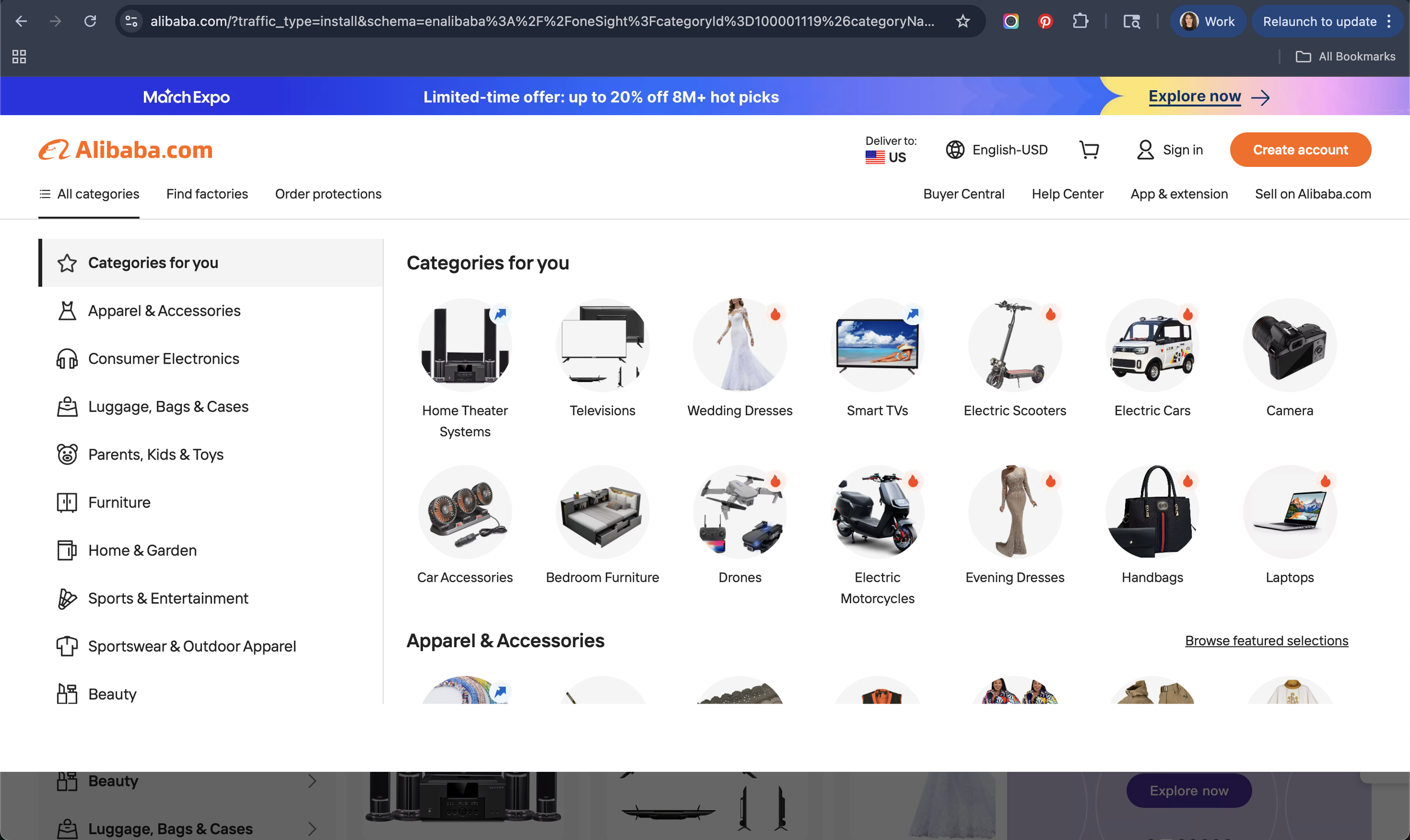
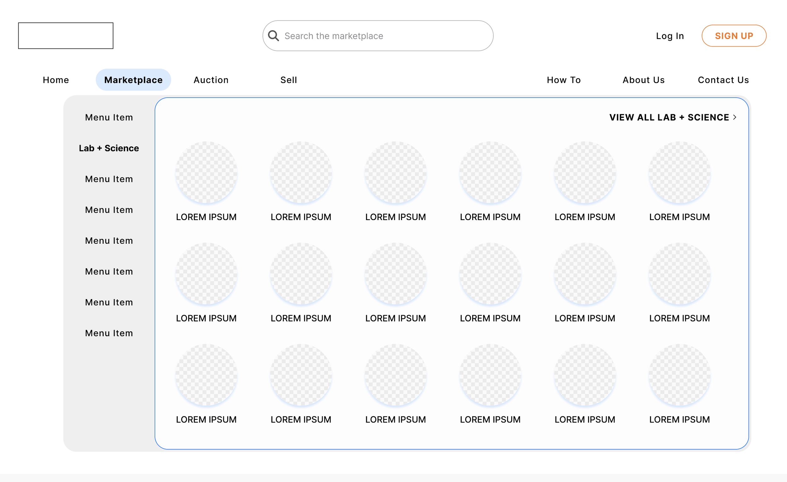
How can we help users find what they need, and give ourselves the ability to host thousands of products? I looked to Alibaba for guidance, with its category-driven mega menu. The split navigation layout allows for users to search by top-level industry taxonomy, and then a visual grid for product categories.
Iterating
Product Cards
My first stab at the product cards contained a field for a short description—helpful, I thought, for people looking for specific product types. But I scrapped it because, after a conversation with the CEO, I learned it would be fighting against seller behavior: sellers don’t format product descriptions consistently enough to make them actually helpful. Despite being a small text field, many used line breaks that splintered the information and would render it useless on a card. The sellers I was using as a reference were an outlier with how consistently they filled it out.
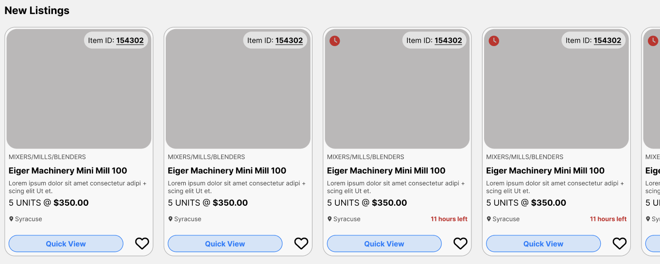
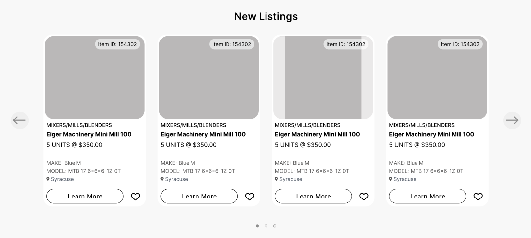
I also removed the share field: it’s too early in the user journey to justify, and less valuable now that buyers can open a product’s [shareable] detail page more easily. I brought the item ID to the upper right corner instead, as a easy-to-find reference point. (Its opacity decreases on hover.)
With all this new space, I added back in Make and Model, higher value information. Through conversations with the client, I learned that photos are one of the most important pieces of information to a buyer. Providing detailed images of the machinery is key to earning their trust—especially if they’re not going to see the product in-person until after they’ve paid for it. So, I designed product cards that prioritized photos: users can swipe through images on the card before clicking into a product. For handoff, I also designed a sample card demonstrating how the image container would adjust to pictures that don’t meet its proportions.
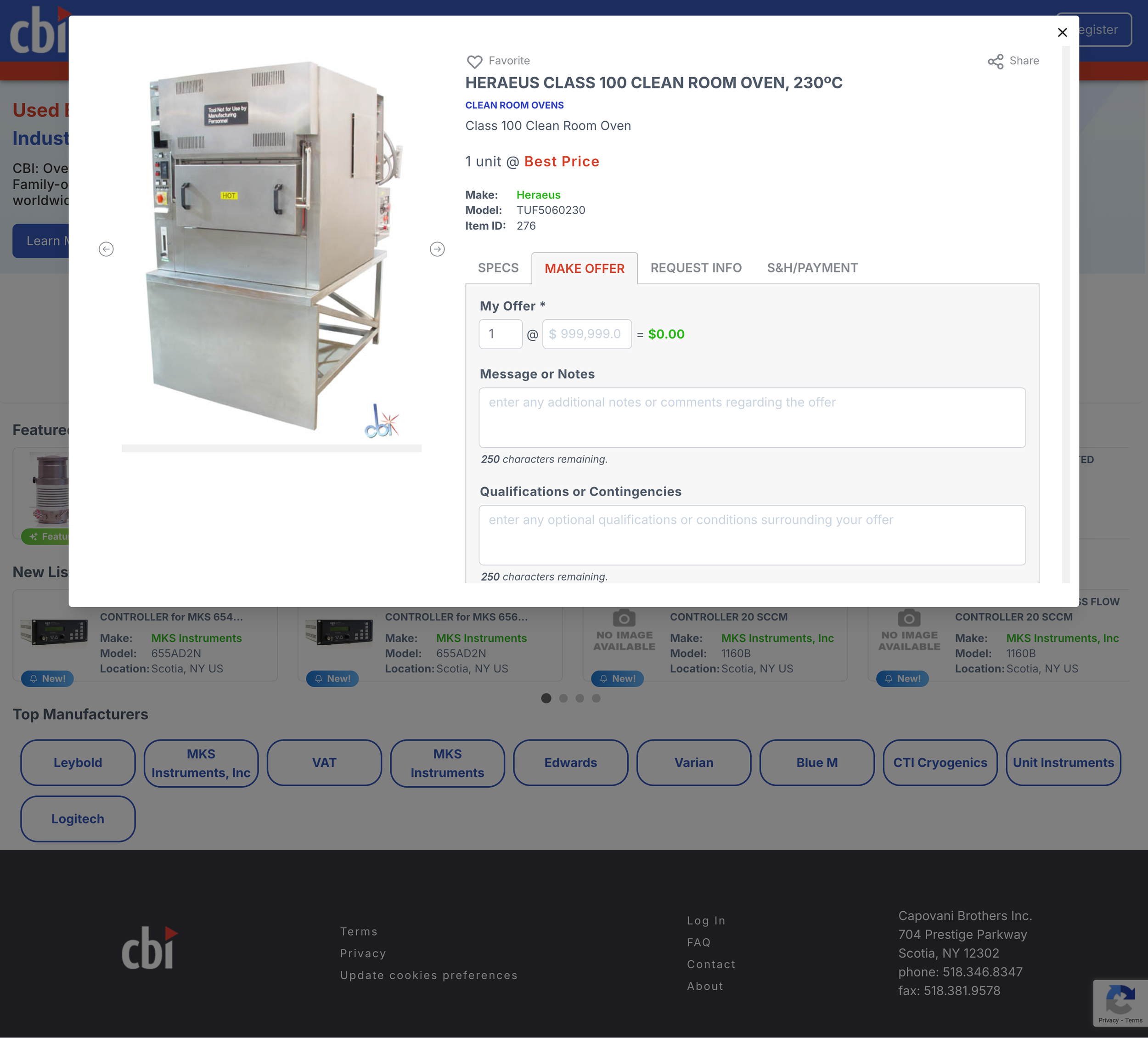
Product detail pages
I designed full product detail pages to replace the popup system. Now, whenever a user clicks on a product, they’re taken to a new page with all its information. I redesigned the “Make an offer” flow from a tab-based design to an easy-to-find—and operate–button-first layout. And, call me a peace-keeper, I brought the pop-ups back, making it easy for users to quickly input their information without leaving the page.
Product discovery
Since KeySurplus is going for low-lift, high-reward changes, I kept the filtering system within its existing framework — with some improvements to usability shared in my initial assessment. I did leave them with an Alibaba-inspired menu layout to play around with, though.
Conclusion
I successfully handed off the new design system to stakeholders. These components are currently being built by KeySurplus’ engineer, and I’m on standby to do testing once they’re ready.
Here’s how things are going: